Link
Design annotations are needed for specific instances shown below, but for the standard link component, Carbon already incorporates accessibility.
What Carbon provides
Carbon bakes keyboard operation into its components, improving the experience of blind users and others who operate via the keyboard. Carbon incorporates many other accessibility considerations, some of which are described below.
Keyboard interactions
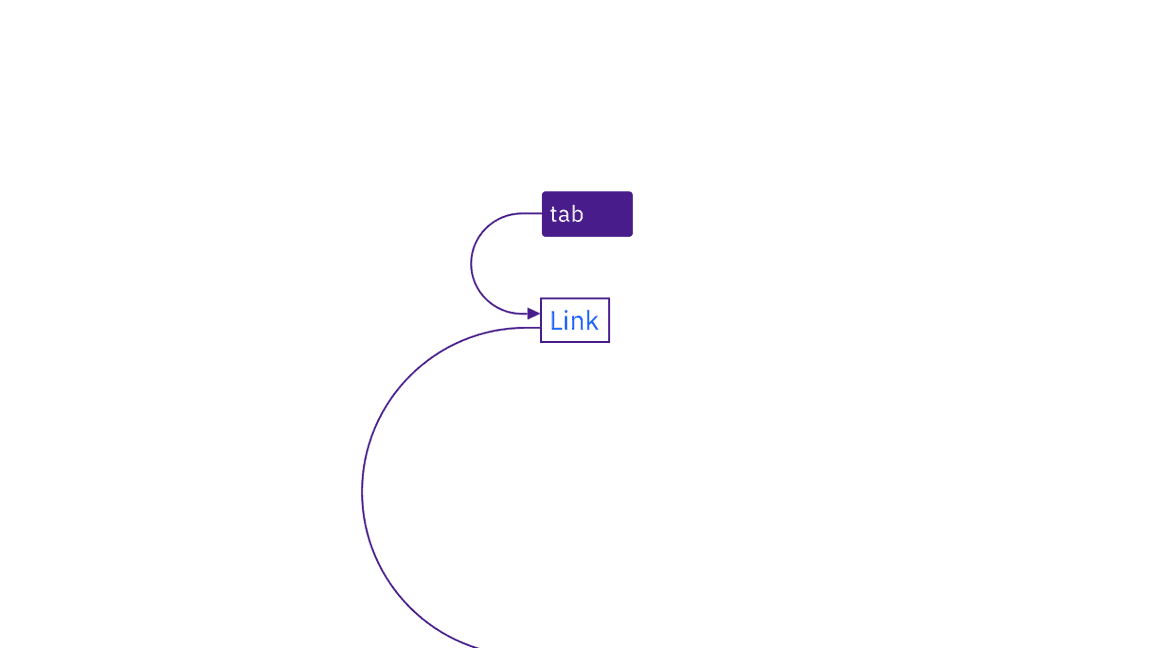
No annotations for keyboard interactions are needed. All links are in the tab order, and activated with standard keys. Where Carbon links are not persistently underlined, they receive an underline on focus.

Links are reached by Tab key and activated by Space and Enter keys.
Contrast
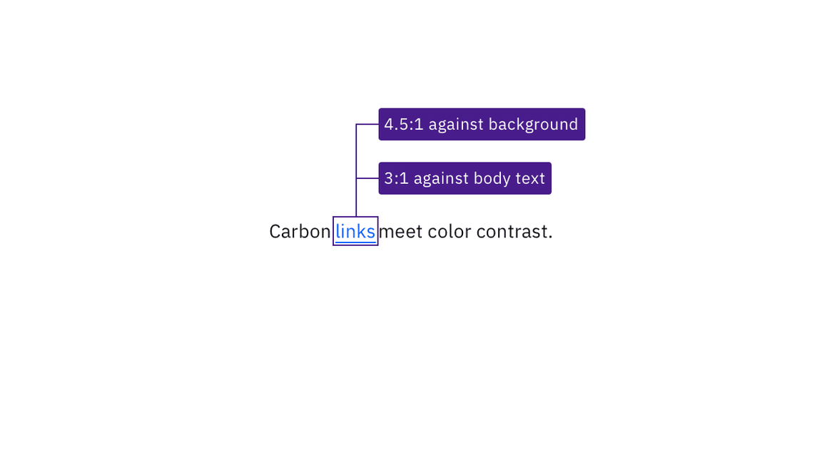
Carbon’s link text color meets the minimum contrast requirement of 4.5:1 with its background. Carbon also uses a link color that contrast 3:1 against body text, so that link text is distinguishable even without an underline.

Link text has sufficient contrast with both its background and surrounding body text.
Design recommendations
Ensure link context
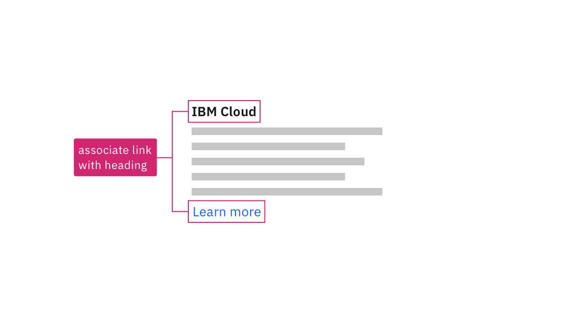
If your design uses generic link names such as “read more,” consider making them unique. Otherwise, annotate a connection with other text in the design that provides context. This will allow developers to implement in a way that increases accessibility. See the Equal Access Toolkit link text topic.

Annotate the connection between generic links and text that gives context.
Development considerations
Keep these considerations in mind if you are modifying Carbon or creating a custom component.
- Associate generic links such as “read more” with other contextual text, using
either
aria-describedbyoraria-labelledby(to concatenate multiple text strings). See the Equal Access Toolkit guidance for more details. - See the ARIA authoring practices for more considerations.